There’s a reason we insist on building responsive websites for all of our clients. As of 1 April 2015, Google prioritises mobile friendly websites in their search results. Did you know that in 2015 mobile users represent more than 50% of all internet visitors? So where your existing – non-mobile friendly – website was earning 2000 visitors per month from Google search, it’s likely now receiving half that. We built ourselves a responsive site because we can’t afford our potential leads drop by half… can you?

What is a Responsive Website?
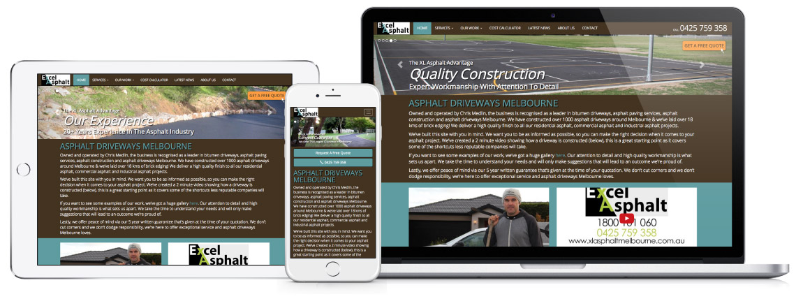
The image above shows a recent site we built for XLAsphalt, an asphalt driveway company based in Melbourne, VIC. As you can see, the site looks quite different on each device and screen size. Responsive web design is all about building a website that rearranges automatically based on the device being used to view it. The goal is to design the website to match the viewable area available and the needs of that user.
Put simply, the way people use a website on a mobile phone is very different to using a tablet, laptop or even a desktop PC with a mouse.
Mobile & Smartphones
Text needs to be bigger on a mobile, you also want to avoid making people use two hands so they can zoom in to view an element, you want to prioritise the information you show to mobile users (you might hide fancy animations or graphics in order to speed up the browsing experience), etc.
Mobile users are often looking for information in a hurry. That’s why, in the example above, we put two bold buttons allowing new visitors to quickly ‘request a free quote’ or ‘call now’. These buttons don’t appear on the laptop and tablet versions of the site as there is more screen real-estate and other opportunities to capture the lead.
Larger screens
At the same time, if your visitors are likely to be using high end equipment with large screens, you want to build your site to fully cater to those users. You might add a full-screen video background to your site, or tonnes of custom animation.
We’ve worked on a number of projects where the target audience was engineers, architects and the like. We found that these users would usually have multiple large screens at work, so we built websites that would stretch right to the edge of the screen, with huge vivid high-quality images and would present the bulk of the page’s information without the need for scrolling.
Retina displays
New laptops are being released with super high resolution screens. An example you’ve probably heard of are Apple’s “retina displays”. These screens have such high resolution that normal web images actually look blurry as a result of the device having to stretch the image over the higher number of pixels.
Responsive web design allows you to pack a higher resolution image into a small space, so that the website looks great on a standard screen and amazing on a retina/super high resolution screen.
The reason to build a responsive site
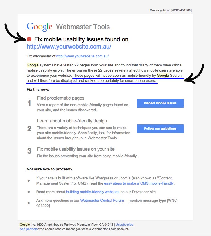
As of 1 April 2015, Google said the following about websites that weren’t responsive/mobile friendly “These pages will not be seen as mobile-friendly by Google Search, and will therefore be displayed and ranked appropriately for smartphone users.” Given that in 2015 more than 50% of web traffic will come from a smartphone/tablet, no one can afford to lose their ranking for mobile searchers.
If you have a website that’s not mobile friendly, you (or your web developer) will have received an email like the one above. It essentially tells you that your site isn’t mobile friendly and that you won’t appear high in search results until you fix it. Google is trying to be helpful here, so they give you a few links to get you started. They are Google responsive website guidelines and mobile-friendly website checker.
Check if your site is mobile friendly
Have an existing website but not sure if it’s mobile friendly? Google have provided this tool to allow you to get a quick read on whether they think it’s mobile friendly. It’s not always 100% accurate, but is a good early check to see what you’re up against.
If you’d rather us take a look at your site, contact us and we’ll let you know whether it’s mobile friendly/responsive or not. No charge, of course.
Website conversion package
While, our core service is developing new websites for businesses. We understand that some people love their existing website and now just wish it would work nicely on mobiles and tablets (and get the associated Google search ranking benefits).
It’s for these reasons that we’re offering a website conversion package. Put simply, we’ll design an almost identical version of your existing site but with 2 key differences:
- Responsive/Mobile friends: We’ll make a website that looks very similar to your existing site on laptops and large screens, and then it’ll re-align content and scale to work nicely on mobile/smartphones and tablets.
- Content management system: Your new website will be built on WordPress. That’s the content management system that powers almost 20% of all websites. It’ll let you update the text, images, menus and add/remove pages on your website without the help of web developer (it’s similar to using Microsoft Word).
Until the end of May, we’re offering to convert existing 1 to 15 page websites into responsive websites for just $1,200*.
* Note: We don’t make changes to your content (text and images), as this is a conversion package only. It’s not always possible to replicate your existing site exactly, but we can usually identify possible issues before we start and will let you know your alternatives. In rare cases your website might be too difficult to replicate in a way that closely matches your original site, so we reserve the right to deny your project, but we’ll always present you with some options.
We'd like to hear from you
If you’d like to learn more about creating a brand new responsive website, or are interested in going ahead with the responsive website conversion, we’d love to hear about your project.


